Content Hub
0-1 PRODUCT DESIGN
DESIGN LEADERSHIP
Content Hub: Centralizing Brand-Creator Content at Aspire
Company: Aspire | Role: Design lead and pod co-lead, sole designer partnering with a PM, an Engineering Manager, and multiple engineers | Timeline: Within a 6-month tenure at Aspire
Impact summary
Led design and helped lead a dedicated pod to build Content Hub, a centralized workspace for brand users to review, act on, and monitor content from their creator partners. In an early prototype review, a brand user's reaction was simple: "Seriously, when can we have this?"
The problem
Managing content had no single home for brand users. They reviewed creator-submitted content in one place, boosted posts or created ads entirely outside the Aspire platform, and checked performance metrics in a third, separate tool. A routine, constant task was fragmented across three disconnected surfaces, with a meaningful part of it not even happening in-platform.
My role & the constraint that made it hard
As sole designer, I owned the design end-to-end while also co-leading the pod day to day: running standups, helping set priorities, working directly with engineers, reviewing completed engineering work for design consistency, and presenting progress to the broader team. The core constraint was building an MVP lean enough to ship fast, but with enough real value that brand users would actually abandon a familiar, if clunky, existing workflow for it.
Process
Discovery: The existing workflow was clunky and fragmented, with a meaningful chunk of the task happening off-platform entirely. This confirmed that unifying the experience, not just polishing one piece of it, was the actual opportunity.
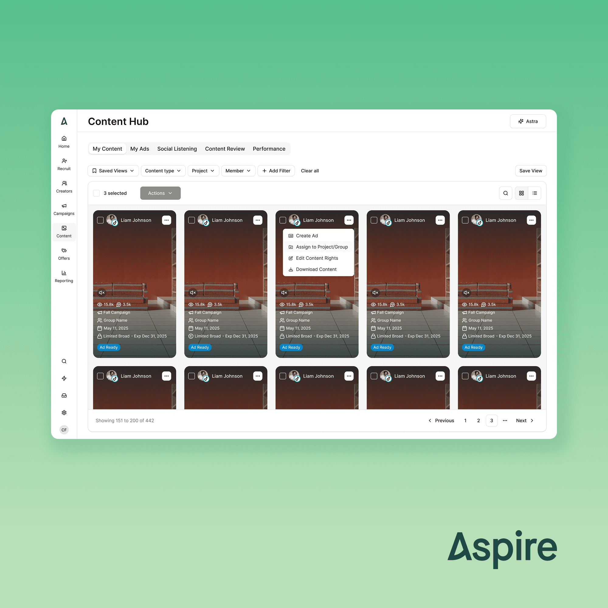
Key decision: I designed around a content-first grid, since for brand users, the visual content itself, photos and videos from creators, was the real decision-making trigger, not surrounding metadata. Each card surfaced critical info at a glance. From there, users could act two ways: a quick-actions menu on the card itself (create ad, assign to a group or project, edit usage rights, quick download) for fast, common tasks, or click into a full-page overlay for more comprehensive workflows like boosting a live ad, viewing ad performance, or finding related content. Approval and social listening lived in a separate top-level view within Content Hub, keeping the core review-and-action flow focused rather than overloaded.
Trade-off: The Engineering Manager proposed infinite scroll for the initial rollout instead of pagination, since pagination required additional backend work. I pushed back. Given how central filtering and bulk actions were to this feature, infinite scroll would have made finding and acting on specific content genuinely laborious, a real usability cost, not a preference. I advocated for the added engineering investment to support pagination instead, because the feature's core value depended on users being able to work through content efficiently, not just scroll through it.
The solution
Content surfaces in a scannable grid with key info on each card, a quick-actions menu for common tasks, and a full-page overlay for deeper review and more complex workflows like boosting and performance tracking.
Outcome
In an early prototype review, a brand user's response was immediate: "Seriously, when can we have this?"
Successfully advocated for pagination over the EM's proposed infinite-scroll approach, prioritizing long-term usability over short-term engineering speed.
The team was disbanded shortly after this work, so adoption and performance data were never collected. The outcome here is grounded in direct user and stakeholder reaction rather than post-launch metrics.


